Print can still be very communicative, if you pay attention to how people read these days. Someone who clearly understands that is the publishers of Inc. Magazine, who recently unveiled the prototype for a new title called Build aimed at mid-size companies.
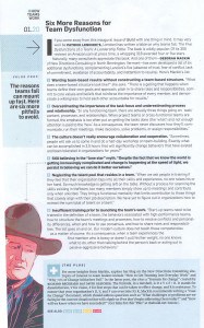
The sample page reproduced here shows how savvy print designers can connect with readers in this era of smartphones, tablets, and Web 2.0. Even though there’s a lot of text on the page, it’s broken into bite-size chunks, most of which use a bold lead-in to allow skimming readers to determine whether they need to read the entire paragraph. In fact, you can pick up the gist of the article just by reading those lead-ins.
In addition to a traditional no-nonsense headline, there’s an eyebrow in the upper-left-hand corner that provides the broader topic. Instead of traditional page numbers, the designer tells you that you’re on the 20th page of the first section, using a color-coded scheme that runs throughout the magazine. The “value prop” at left delivers a quick summary of the article. The graphic does a great job of catching the reader’s interest and offers a nice example of the personality associated with the “lone star” myth. After all, you might like to have John Wayne on your side, but he wouldn’t go for all that namby-pamby teambuilding stuff, would he?
What if you want to know more about the topic? That’s where the blue-screened area at the bottom comes in. In addition to pointing the reader to a germane blog post, it offers four page references to other articles in this issue.
There’s a lot of information on the page, but the key here is that it’s organized in a way to get you to what you — and only you — need to know quickly. That makes this mass-production piece of print communications amazingly personal and effective.
